Accuray Radixact
A three-year project to migrate two legacy clinical systems into one web platform, while rebuilding how the design team operated from the inside.
- Company
- Accuray (via Gorilla Logic)
- Role
- Senior Product Designer
- Industry
- Healthcare · Radiotherapy
- Timeframe
- Dec 2021 – Mar 2026
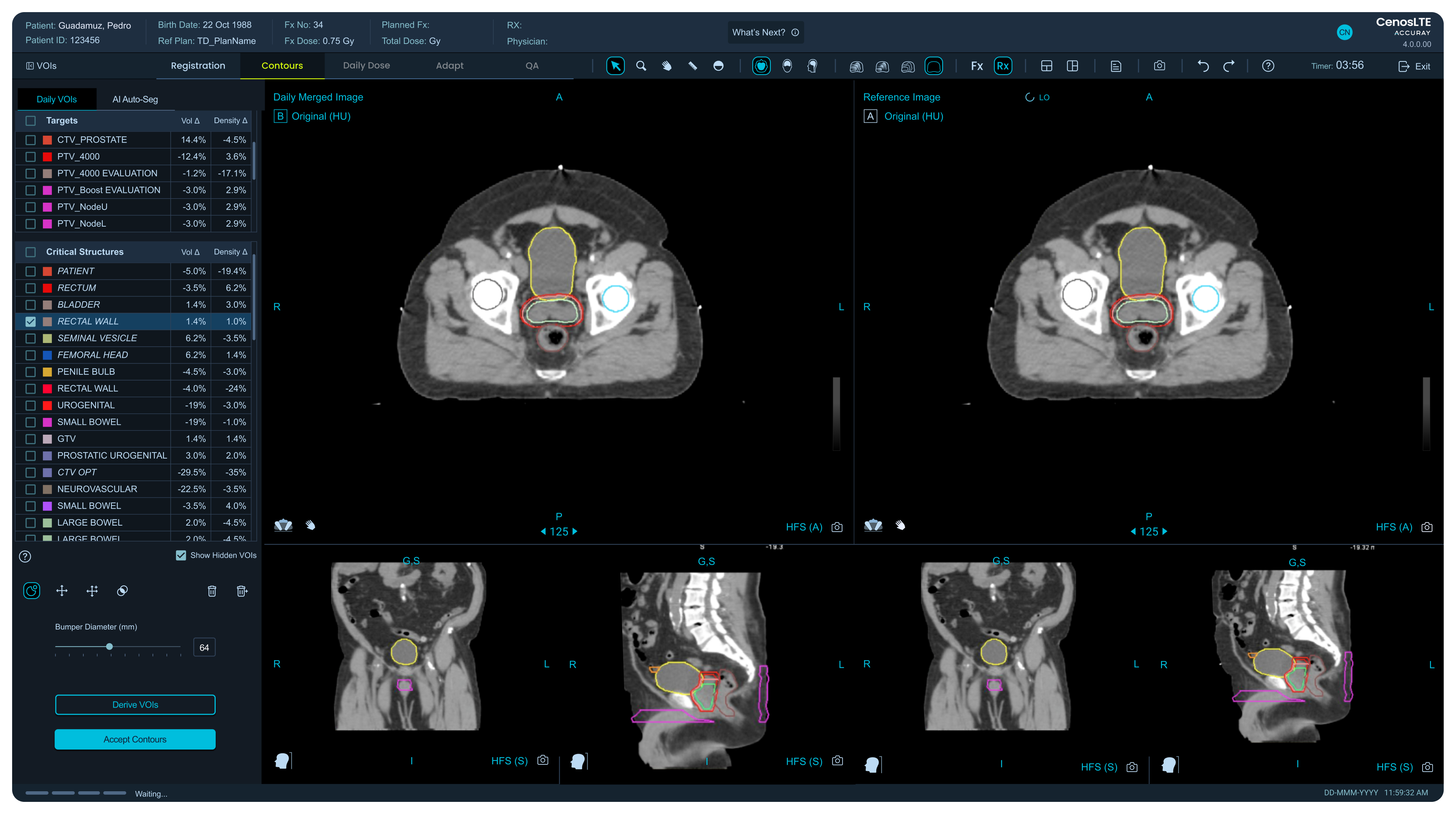
Accuray builds software for radiotherapy treatment planning used by clinicians around the world. I joined as the senior UX/UI designer on a three year project to migrate two legacy desktop systems into a single modern web platform, working closely with the UX Lead. Beyond the screens, I helped reshape how the design team operated inside the company.
The Challenge
Clinicians were working with an outdated radiation therapy planning system. Navigation was confusing, workflows were inefficient, and there was no room for real-time collaboration. These aren’t just usability problems. In radiotherapy planning, every extra step is time a patient spends on the treatment table.
The goal was to bring those two desktop tools together into one web-based platform with AI capabilities, built to support doctors under real clinical pressure.
What I Found When I Joined
There wasn’t a coherent product yet. What existed were scattered components and artboards filled with screenshots from two different desktop systems. The vision was clear but the path wasn’t.
The team was also not set up to move fast. There were no established design processes, no regular touchpoints with product owners or front-end developers, and the other designers on the team came primarily from clinical and usability backgrounds rather than product design. Rather than working around that, I spent time running sessions with them to build a shared understanding of how browsers and front-end development work. That investment built trust, and that trust gave me the room to take ownership of the parts of the product that needed it most.
Building the Conditions for Good Design
One of the first things I did was define design values and a north star for the team. Without that, decisions were inconsistent and slow. I introduced structured feedback sessions where designs were reviewed regularly, which sped up iteration and reduced back and forth later in the process.
I also established alignment sessions with product owners and front-end developers. With engineering specifically, we made it a practice to inspect code together and do visual QA side by side. That changed the relationship between design and development from handoff to collaboration.
These weren’t glamorous contributions but they made everything else possible.
Understanding the Users
There was already some user knowledge inside the company but it was mostly informal. Together with my lead I ran walkthroughs and targeted interviews with clinicians to give that knowledge more structure.
Three things came out of that research clearly. Precision, visibility, and speed were non-negotiable. Legacy systems created friction through poor navigation and confusing interactions. And some workflows had to stay exactly as they were for compliance reasons, while others had real room to improve.
We turned those insights into an empathy map that became a reference point for the whole team when making design decisions.
The QA Flow: Full Ownership From Sketch to Testing
The area where I had complete end-to-end ownership was the Quality Assurance flow. This is a critical moment in treatment planning where doctors need to compare dose calculations from two different systems before proceeding. Under the old setup that meant switching back and forth between separate applications while a patient waited.
I redesigned this from the ground up, from initial sketches through wireframes, high-fidelity prototypes, and multiple rounds of usability testing. The result was a single unified view where both sets of data lived side by side. Clinicians no longer had to jump between systems at a moment when their full attention needed to be on the patient.
Presented at ASTRO and ESTRO
Although the platform hasn’t launched commercially yet, it was presented at ASTRO and ESTRO, the two most important radiotherapy conferences in the world. Clinicians tested its core features directly and the feedback centered on one thing consistently: how much more usable it felt compared to the existing tools. That kind of validation from the people who will actually use it under clinical conditions is hard to come by before a product ships.
Results
- Two legacy desktop systems merged into one web platform
- QA comparison workflow reduced from two separate systems to a single unified view
- Design values, north star, and feedback culture introduced from scratch
- Regular alignment sessions established between design, product, and engineering
- Design system started and later adopted as a standalone company initiative
- Product presented at ASTRO and ESTRO with positive usability feedback from clinicians
What the UX Lead Said
“What stood out most about Gil was his ability to turn complexity into clarity. He quickly understood nuanced clinical workflows and translated them into thoughtful designs, interactive prototypes, and clear workflow diagrams that aligned stakeholders and accelerated decision-making. He asked great questions, surfaced edge cases early, and delivered on time with minimal oversight. He raised the bar for our UX practice. I’d gladly work with him again and recommend him without hesitation.”
— Cristina Negrut, Staff Engineer, Usability and UX Lead