
Evolving a radiotherapy system into web
- Company
- Accuray
- Role
- Senior Product Designer
- Industry
- Healthtech · Radiotherapy
- Timeframe
- Dec 2022 – Mar 2026
Challenge & context
Accuray builds software that helps doctors treat cancer with radiation. Patients change between sessions. A tumor shrinks. A patient loses weight. When that happens, the doctor needs to update the treatment fast, sometimes with the patient already on the table waiting.
Accuray had two separate desktop tools doing pieces of this job. They needed to become one, on the web, without slowing doctors down.
Key challenges
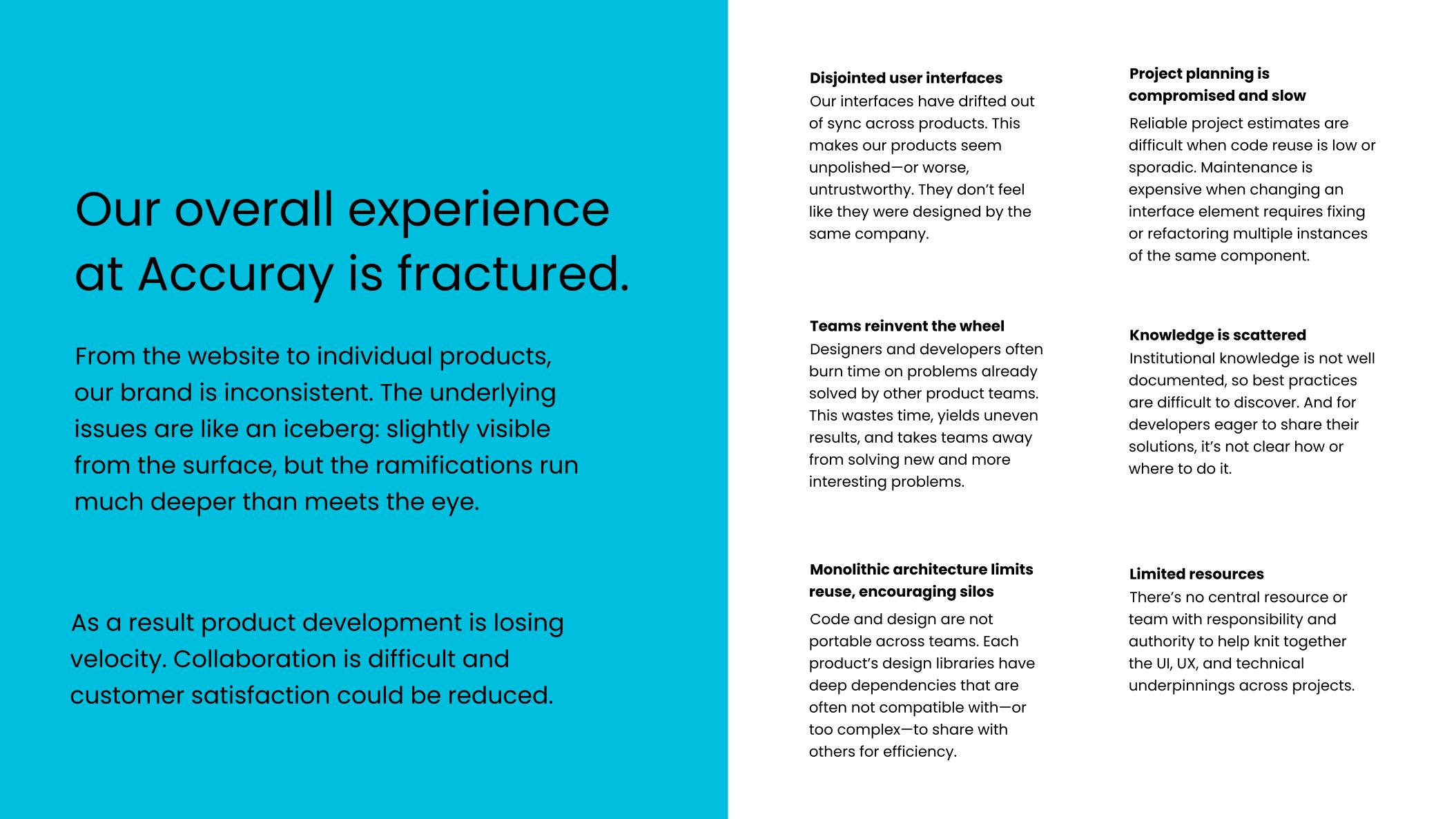
- No shared design system. No components, no rules, no documentation. Three designers were pulling screens from one messy file. Every screen looked and worked a little differently.
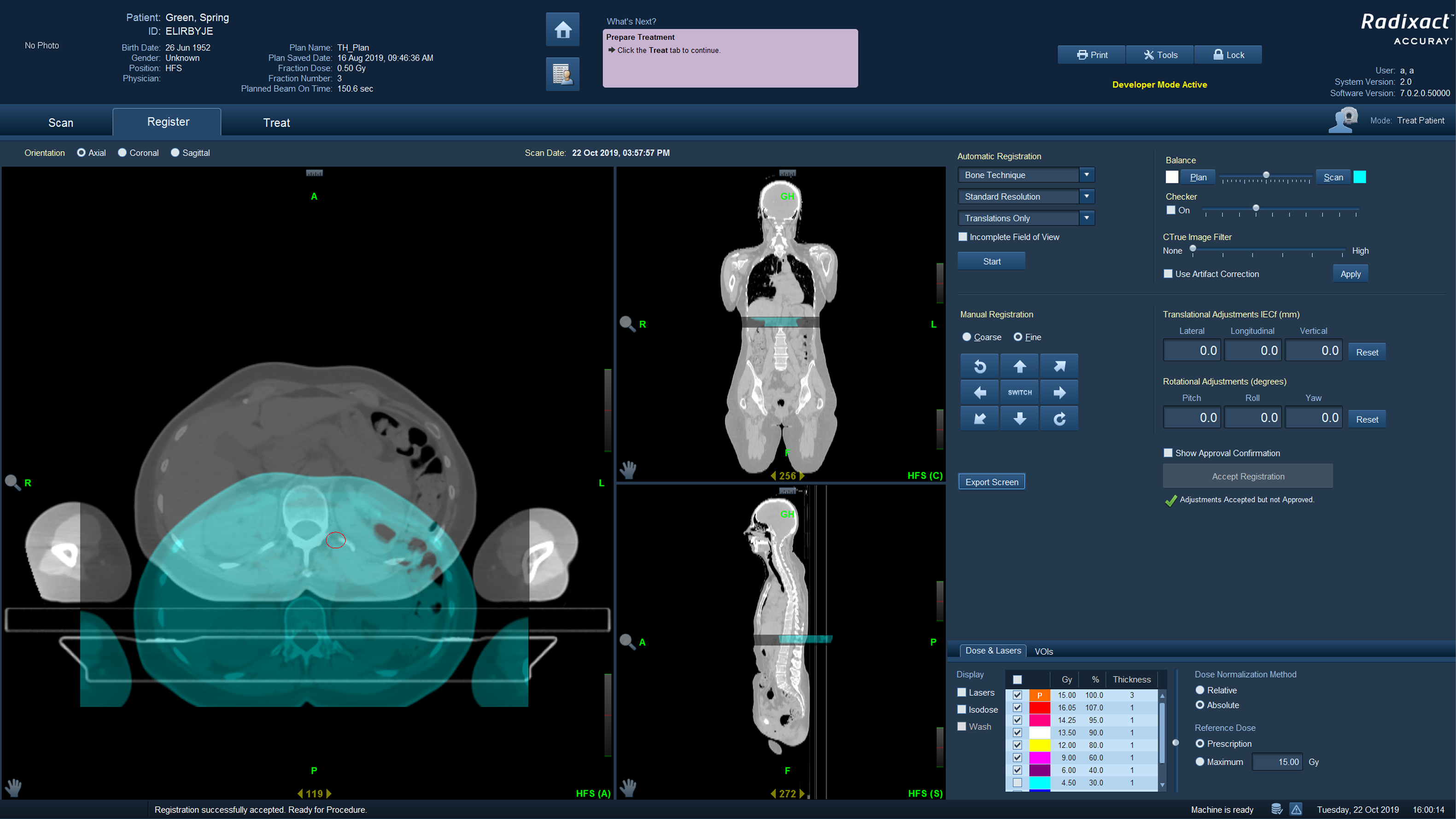
- The two old systems were built by different teams, years apart. Same job, different names for things, different layouts, different ways of doing the same task. Merging them meant every screen felt like a different product stitched next to the last one.
Role & scope
Four years, evolving scope
The first two years alongside two other designers, then the only product designer left, working closely with a usability lead, subject matter experts, and full stack developers.
Ran my own research
Interviews and usability tests with the doctors and therapists who use this software daily.
FDA regulated
Every change had to pass FDA review before it could ship, so speed was never free.
Design system lead
Proposed it myself, then grew it from scratch, pairing closely with engineering to ship it in code.
What I led
One layout, not fifty different ones
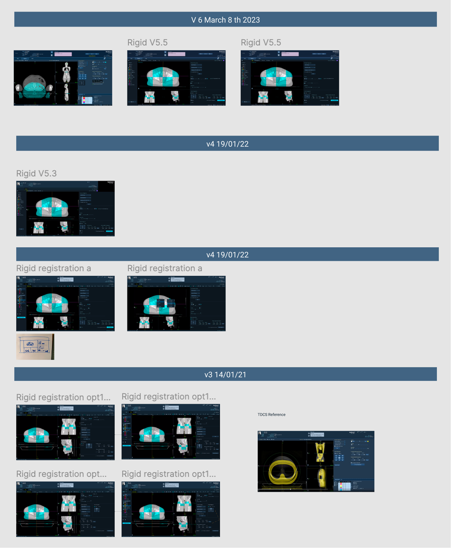
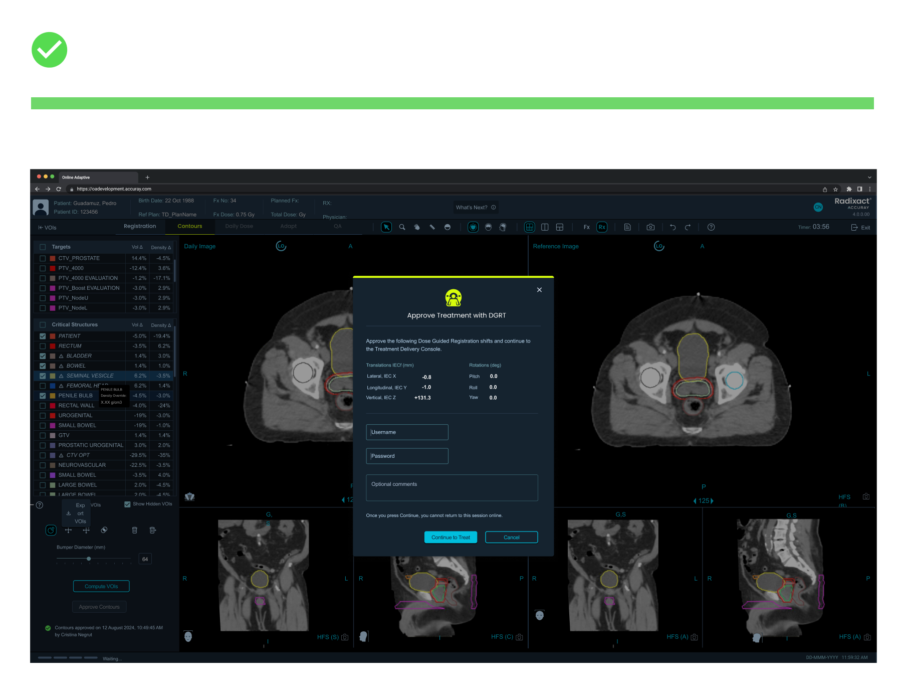
Every screen behaved like its own product. Buttons in different spots. Menus that worked one way here and another way there. Doctors had to relearn the interface every time they moved between tasks. I sat with the doctors and watched how they actually worked, not how the manual said they should. Then I built one layout that every screen would follow: same spot for the menu, same spot for the controls, same spot for patient info. Learn it once, use it everywhere. I tested this base with real clinicians before building anything on top of it. Once it worked, every other fix got easier, because they were all building on the same ground instead of patching fifty different ones.
Giving the scan more room
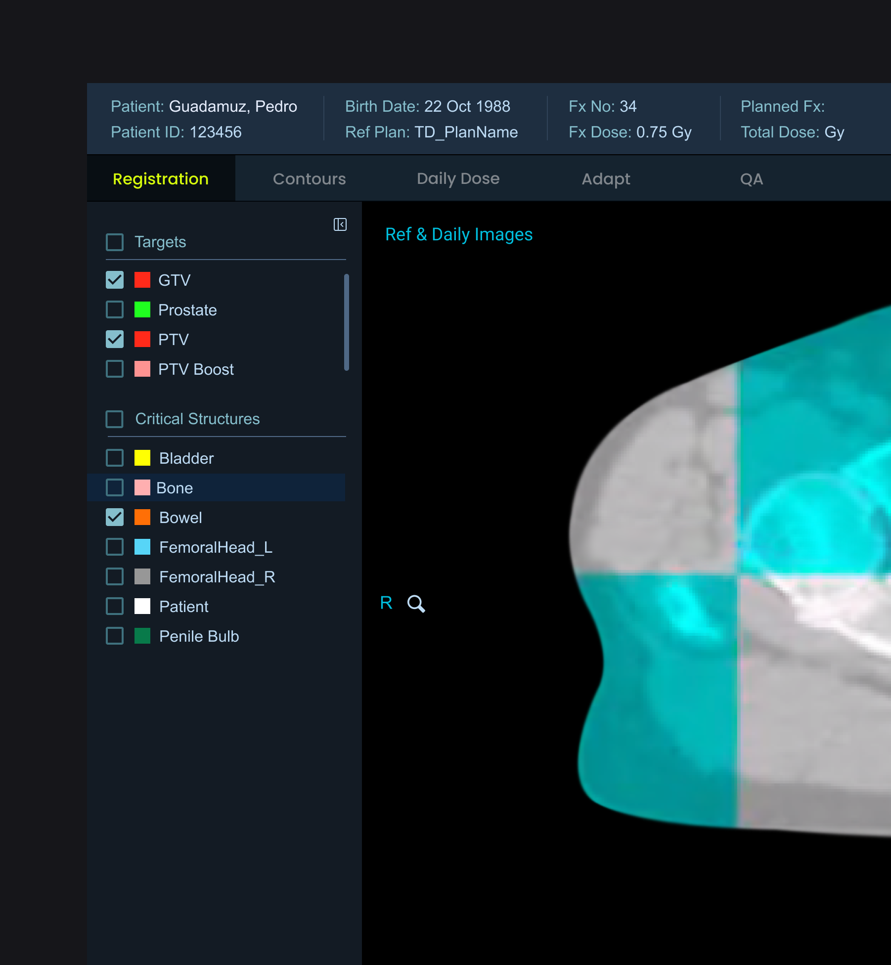
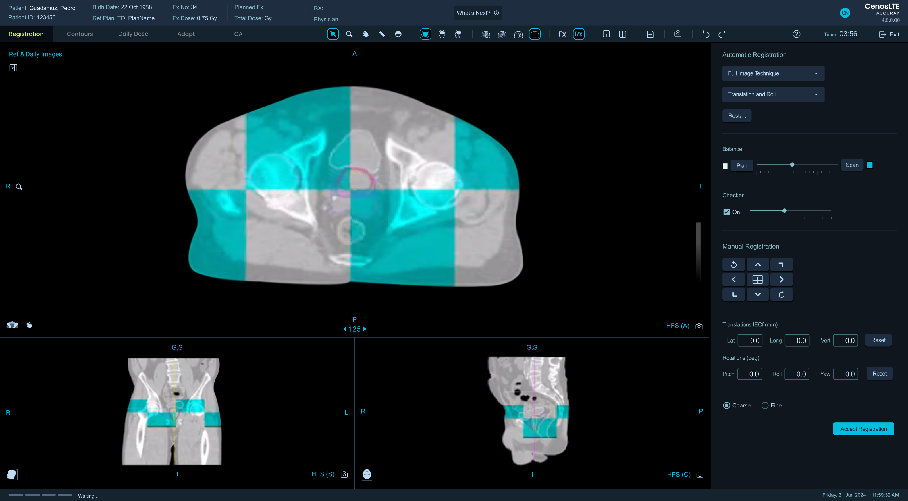
The main screen doctors use shows a scan of the patient. Around it were permanent panels listing every single body part, all open, all the time, even though doctors usually only need to look at one or two at once. I made those panels collapsible so the scan itself could take up more space. People were nervous about this at first, since they were used to seeing everything on screen. Once they tried it, they liked it. Bigger scan, easier to compare two scans side by side, and it worked on any screen size, including doctors logging in from home.
Error handling as a system
Nearly every error opened a big pop up telling the user to call customer service. In a product where a treatment can change while the patient is on the table, that stops the doctor at the worst possible moment. The team had normalized it. I did not patch it screen by screen. I documented every kind of error, ranked how serious each one was, and decided what the interface should do for each: a small message next to the field for a typo, a short notification for something the system can fix on its own, and the big pop up only for problems that really must stop the user. The value was turning improvised error handling into a system with a clear rule for every case. Calling support used to be the answer to almost everything. Now it only happens when something really needs it.
The design system
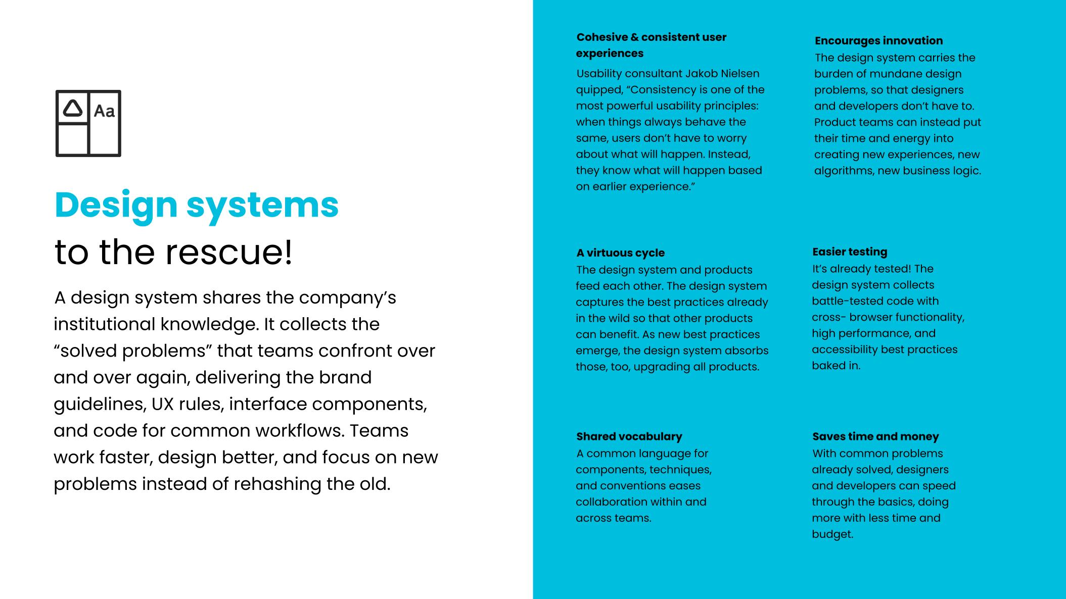
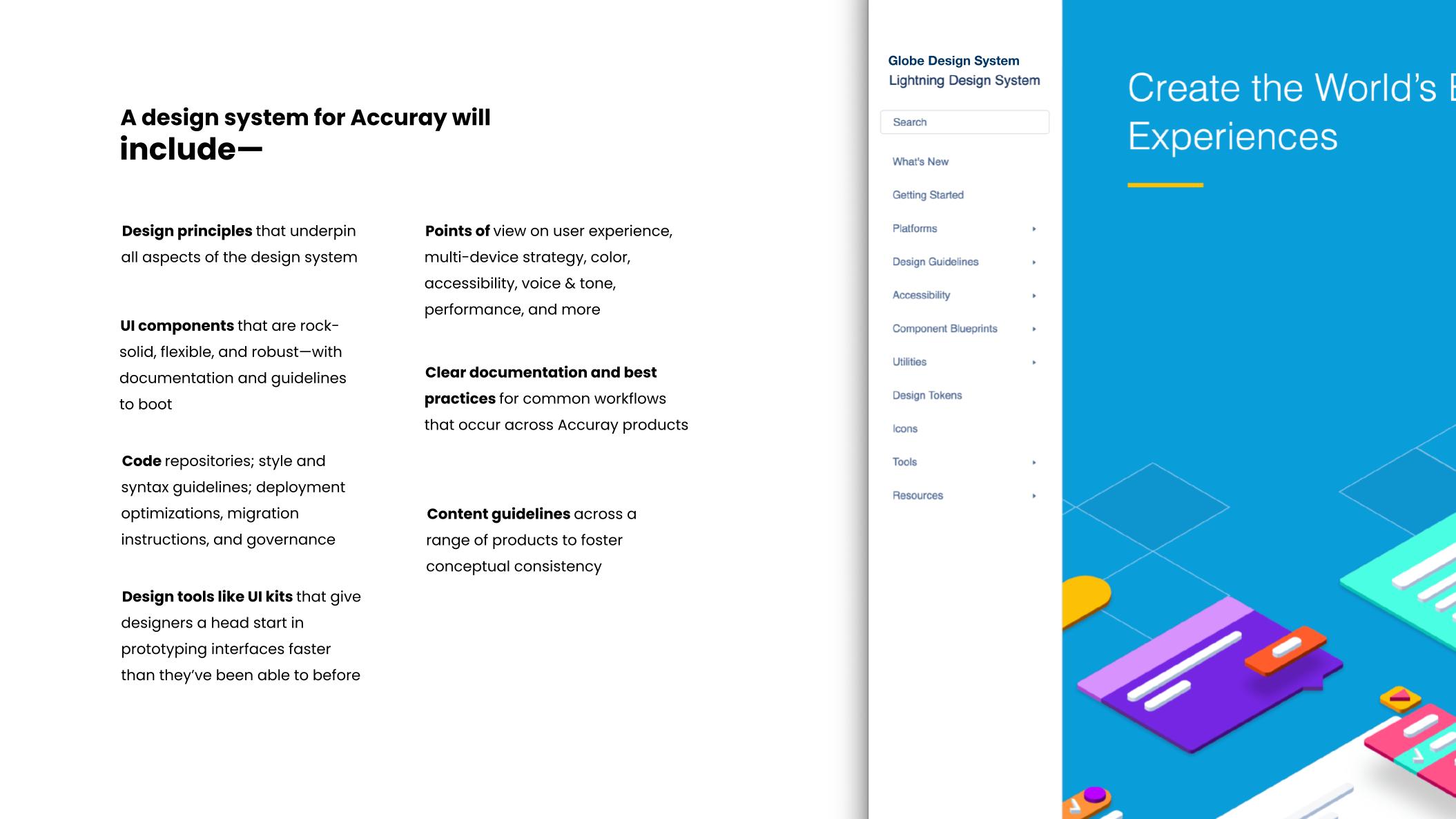
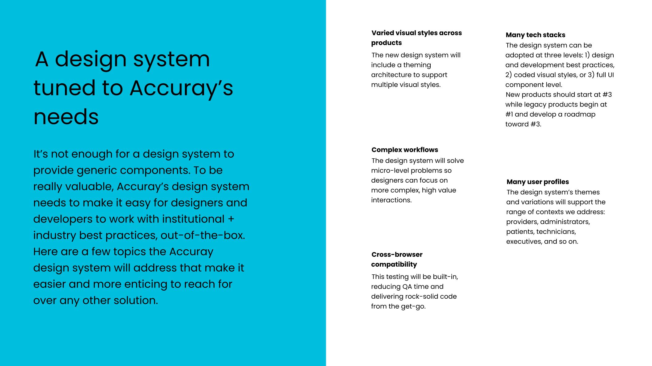
Fixing this wasn't just about consistency. If the interface layer was solved once, engineering could move faster on everything built after it, and design could spend less time on repetitive screens and more on the strategic problems the product actually needed. Nobody assigned this to me. I decided it was mine to own, because I was the one seeing exactly where that time was leaking. I built the case for it, and what I got back was influence and permission to spend my own time on it.
Making the case, and getting the go ahead
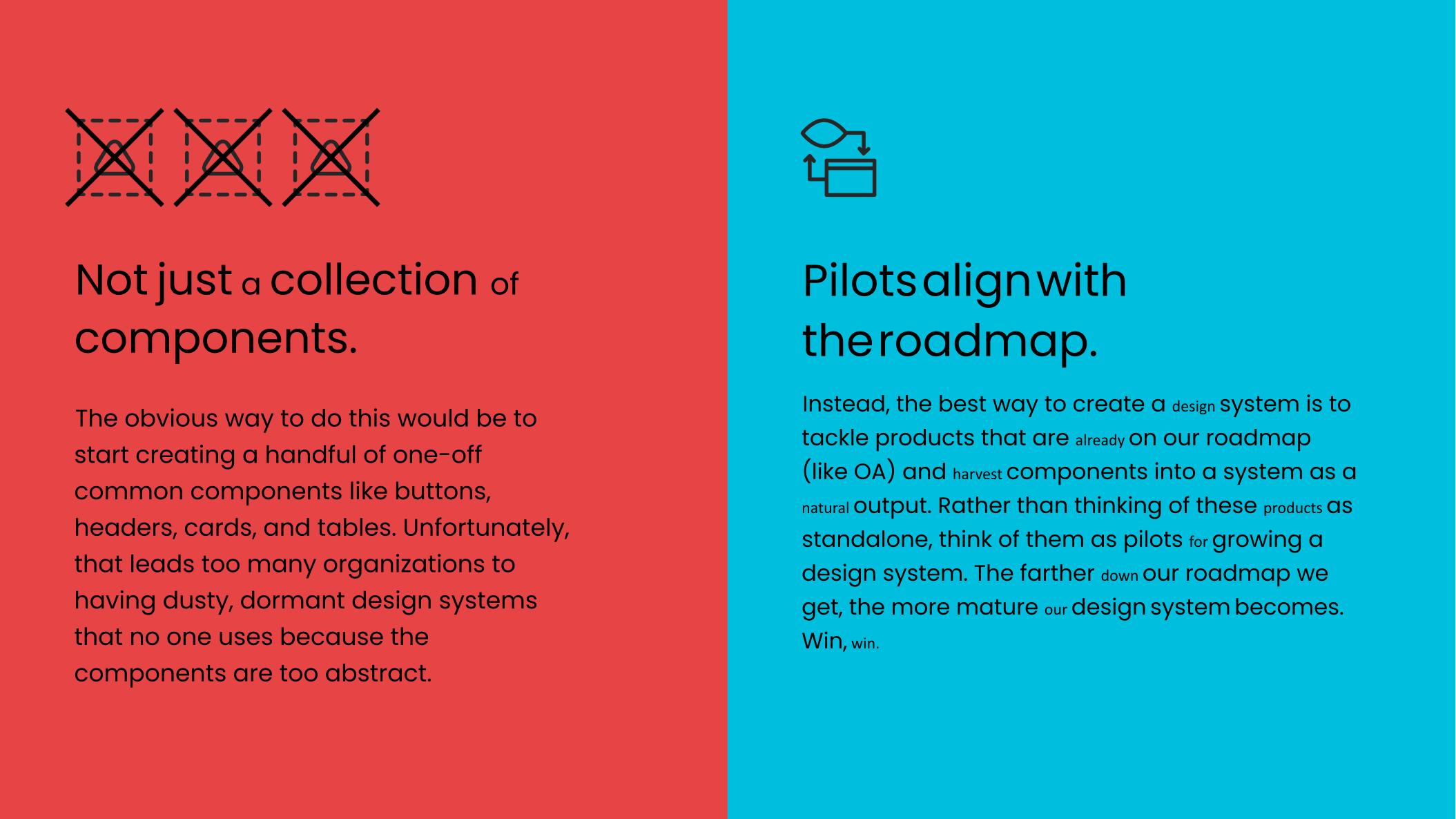
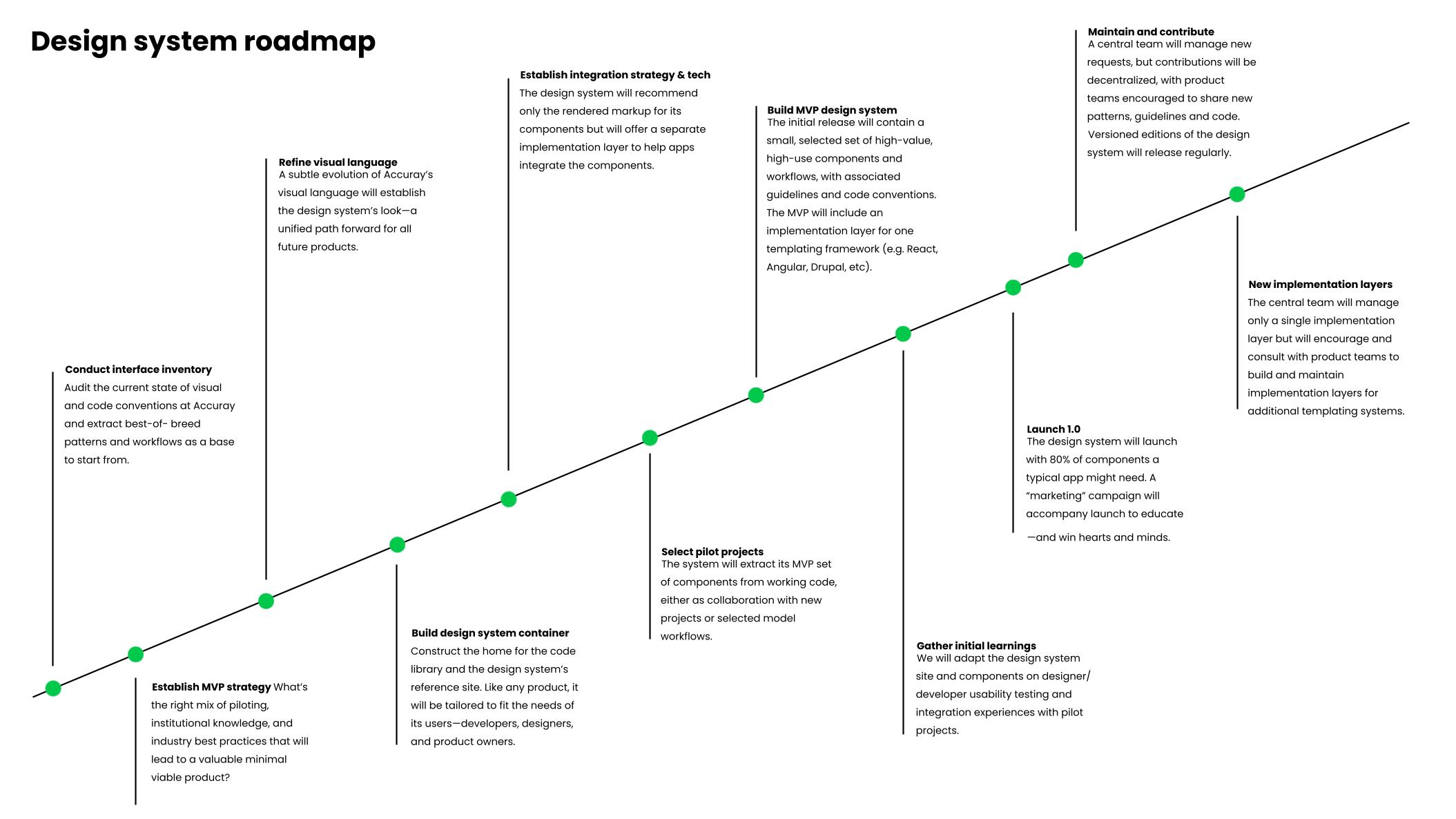
I mapped stakeholders, aligned the Frontend Lead and DevOps early, and prepared a phased roadmap tied to real product releases. When the business decided the pilot would become the template for the rest of the company, I pitched it. It got approved without a budget, and I had planned for that. What I got was influence and permission to allocate my own time. That was enough to start.
AI assisted workflow
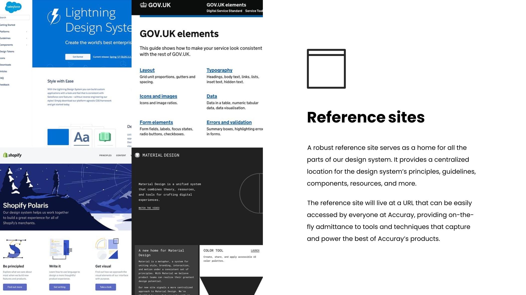
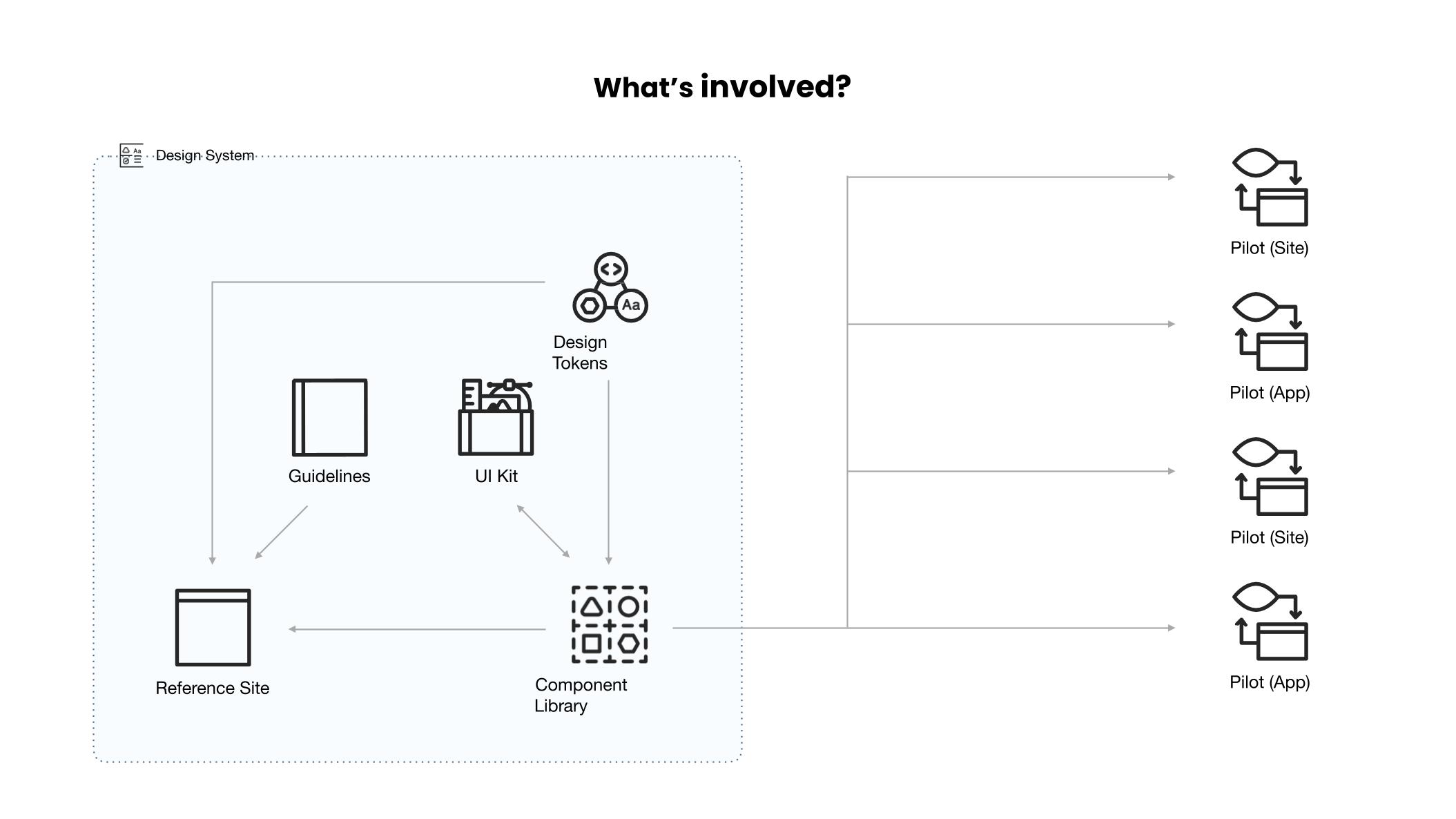
I designed and operate the entire documentation layer with an AI assisted pipeline: tokens exported from Figma to JSON, Claude drafting component docs, and the reference site itself built in Figma Sites with Claude scaffolding pages and copy. Without the AI layer, the reference site would have taken months I did not have. This is what let a working documentation site ship in parallel with the components it documented.
How the system works
Figma is where tokens and components live. Claude turns that source into documentation and scaffolds the reference site in Figma Sites. Storybook is the shared workshop where design and engineering run visual QA together. Consuming products pull tokens as CSS variables and components as code, so parity is enforced by structure, not by discipline.

Adoption model
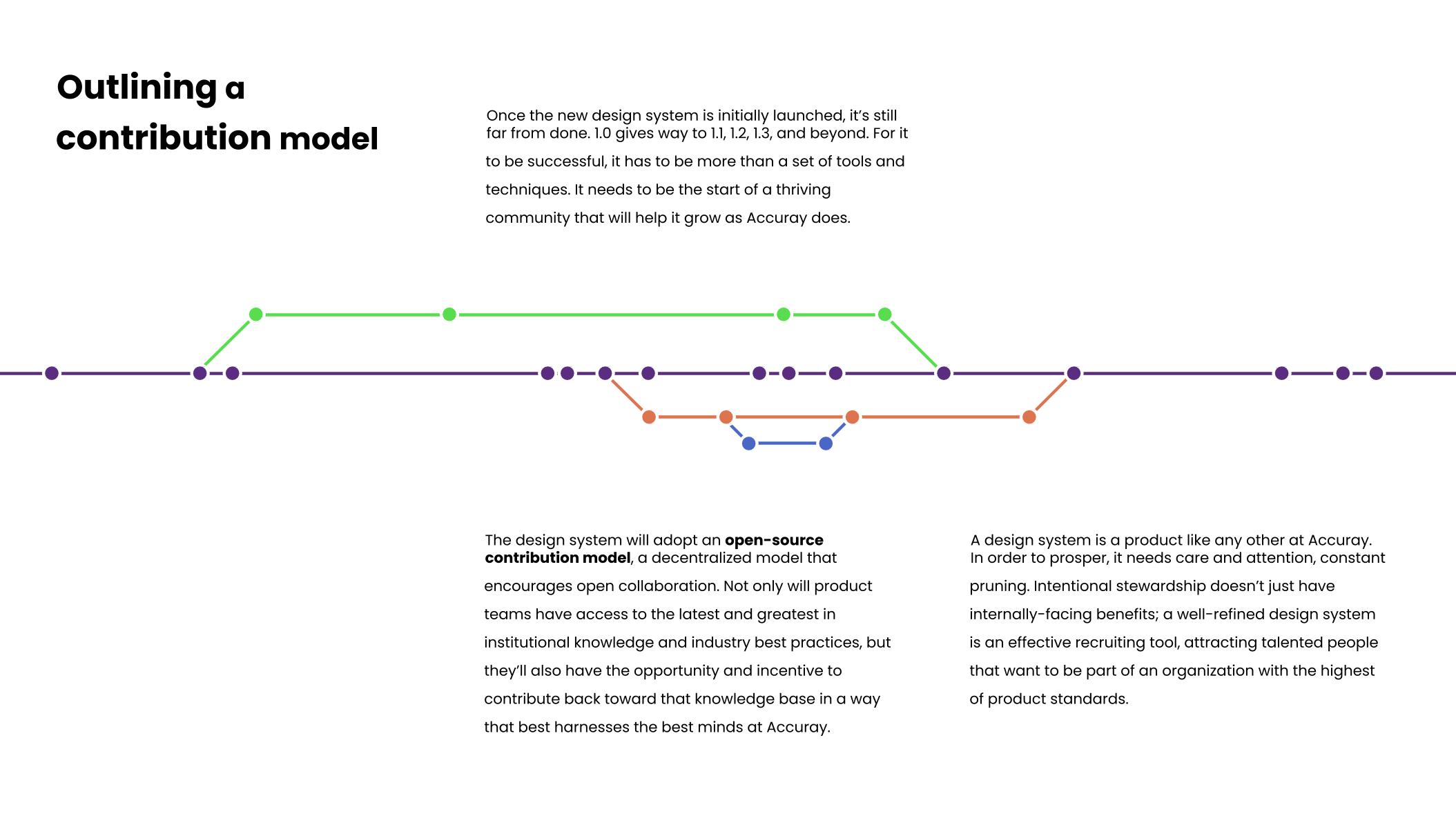
The system was not going to adopt itself. I partnered with the Scrum Master and Product Owner to protect dedicated frontend capacity every sprint, and my UX Lead and I kept the backlog ready before every PI. Beyond our own team, I ran monthly syncs with the satellite teams still on older stacks, showing them what the system solved and how to start pulling from it. Adoption was not a launch. It was a rhythm I designed and maintained.
- ⏰ Weekly open office hours
- 🎨 Weekly design internal sync
- ⏰ Weekly open office hours
- 🎨 Weekly design internal sync
- 🚀 Monthly demo
- 🛫️ Design system onboarding
- 🚀 Monthly demo
- 🛫️ Design system onboarding
- 🤍 Weekly accessibility touchpoint
- Slack channel
- 🤍 Weekly accessibility touchpoint
- Slack channel
Impact & evidence
Product
- 25% faster. The full update at the table went from 20 minutes to 15.
- ~50 minutes given back per day at a clinic doing 10 updates daily.
- 100% error recovery in testing. Every person in usability testing fixed a serious error on their own, no help needed, no mistakes made.
- Merged two old systems into one platform. Presented at ASTRO and ESTRO, two major radiotherapy conferences, with strong feedback from clinicians.
Design system
- 90% of components now shared across the platform.
- 2 other products adopted it, a third was in progress when I left.
- ~1,600 hours of repeated work saved in the first three months alone.
- Survived two rounds of layoffs without losing pace, because the system was already doing a lot of the heavy lifting.
“What stood out most about Gil was his ability to turn complexity into clarity. He quickly understood nuanced clinical workflows and translated them into thoughtful designs, interactive prototypes, and clear workflow diagrams that aligned stakeholders and accelerated decision-making. He asked great questions, surfaced edge cases early, and delivered on time with minimal oversight. He raised the bar for our UX practice. I'd gladly work with him again and recommend him without hesitation.”

Cristina Negrut - Staff Engineer, Usability and UX Lead
Contact me for the full case-study